We had the critique this week. My theme didn't come across very well, though the piece itself was pretty successful. The blue-grey background worked very well with the orange on top. Overall, I feel like this piece looks a little flat and boring. It needs texture, which Coach said using the Golden acrylics would give me.
|
I really liked the rough blank edges on the two sides of the canvas, but it looked incomplete at the end. I went over the white edges with the same blue-grey background that I used for the rest of the piece. Then, I went back with an orange. With the salmon rectangle in the middle and the sunset-orange towards the sides, this piece literally represents detachment. However, without calling the piece itself "Detached", I don't think I'm getting the feeling across to the audience, which may or may not be a bad thing.
So, I know that I said that I wouldn't continue with the abstract paintings, but I think this piece is turning into one. I very much like the background, but as far as the distorted face I was going to put in the middle - not so much. I've changed what started as an attempt of a face to a rectangle and found new meaning. I want to convey a feeling of detachment, although I'm not sure how this piece will accomplish that. Our society has an odd fascination with disconnectedness - in some places, we are supposed to be connected to the environment and the people around us, while in others, we are expected to detach ourselves from the situation. Surgeons and others who work in the healthcare field face the same expectation. In order to successfully treat their patients, doctors cannot become emotionally attached to every single one of them. But to what standard are we expected to be detached and how does this play a role in our own development.
As soon as we came back, we jumped into a new project. I have decided against my abstract paintings. I'm tired of the same old lines, colors, and compositions. This time, I will draw a face, though a little distorted. 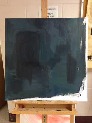 I have to admit, as dreary as the color scheme is, it's a refreshing new start from the red, black, and white. Also, I've left white space across two of the borders. This was unintentional at first, but now I'm starting to like it more and more.
|
AuthorI am a senior taking Art V at Maggie Walker Governor's School. Archives
March 2017
Categories |


 RSS Feed
