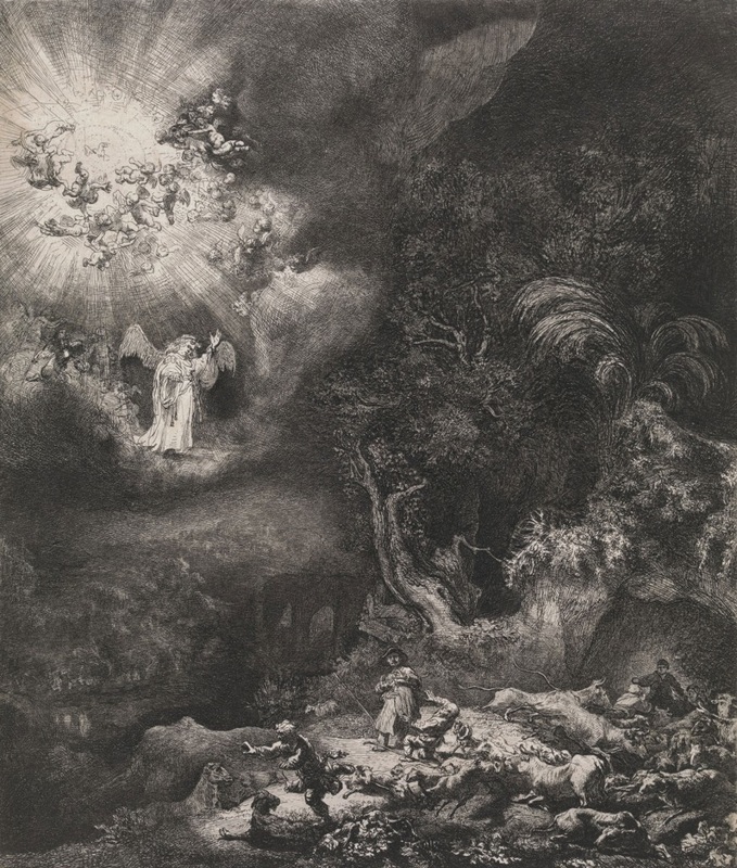
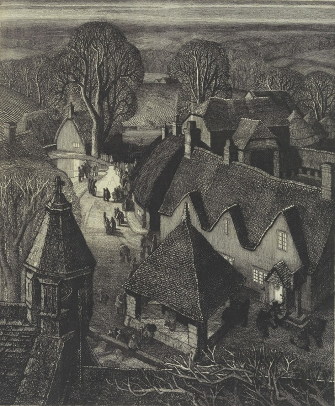
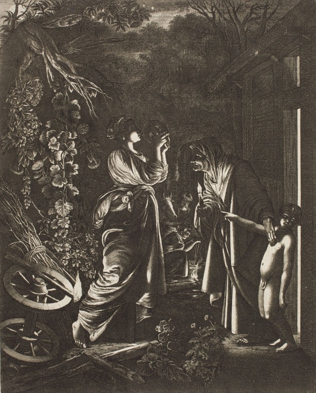
At first, I found the lack of bold, or even pastel colors a little putting off, but in the end, it helped me focus more on the forms and the boldness of the lines in each work. There were clearly many different types of printmaking design used by the artists included int his exhibition, but they were unified by their lack of color that I usually find so appealing. Also, the darkness surrounding the pieces created an air of mystery that made them even more enticing. Overall, I really enjoyed the exhibition despite the fact that it was very far from my own taste. Though, I wonder if these pieces would have been more successful in accomplishing their goals if they employed color. Also, since I am currently struggling to find meaning in my process and materials, I would love to know how the artists chose their printmaking technique - did they just choose a technique with which they were comfortable or do they apply a technique that they have mastered depending on the subject matter of setting? In my work, I want to maybe mute down to colors, if only at first, and focus on light vs. shadow and the forms that clash and flow together.
AuthorI am a junior taking Art IV at Maggie Walker High School. Archives
March 2017
Categories |
 RSS Feed
